Starfall Media Branding
Home ➔ Starfall Media
Overview
Starfall Media existed as a collective of artists and designers that would take on art, design and video editing commissions from content creators on the internet. They wanted branding and especially a logo that reflected their professionalism and star motifs.
Logo Version 1
The first rendition of the logo focused on looking almost like a star eye, with a moon shape encapsulating a star with eyelashes.
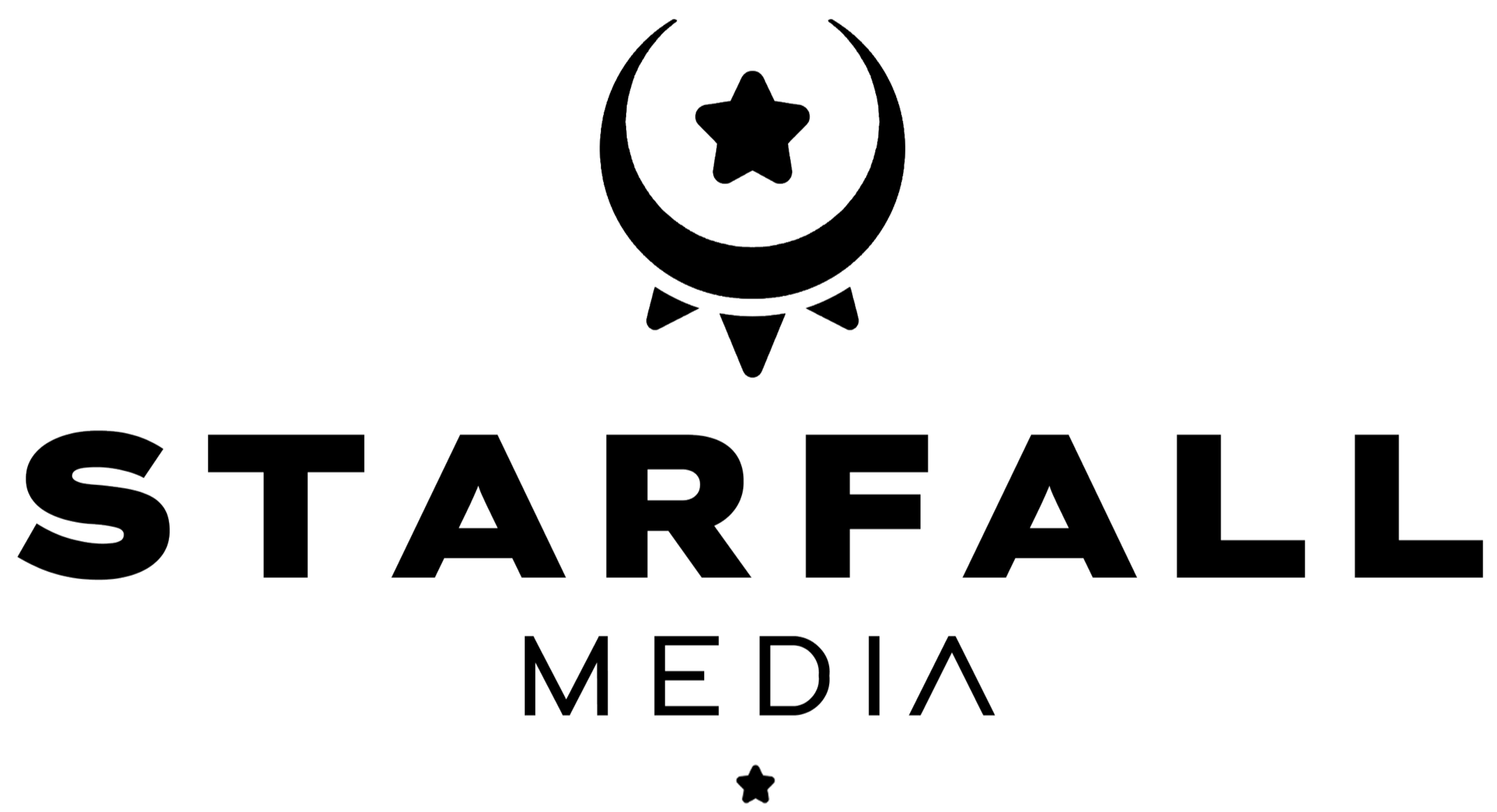
That said, the logo still felt unrefined and not up to the standard that the collective wished for.
Logo Version 2
Within the second rendition of the logo, I tried to tell more of a story. Inspired by the name “starfall”, I created what looked like the impact of the star on the moon shape this time, while retaining the broad shape that they liked from before.


That said, while the black and white was well recieved by the client, the simplistic font and flat look were not. These would be the main points of improvement going forward in the next phase of development for the brand
Finalized Branding
The finalized logo takes the shape from the second version. The edges were made sharper, and a font was selected that fits more in line with the brand image.
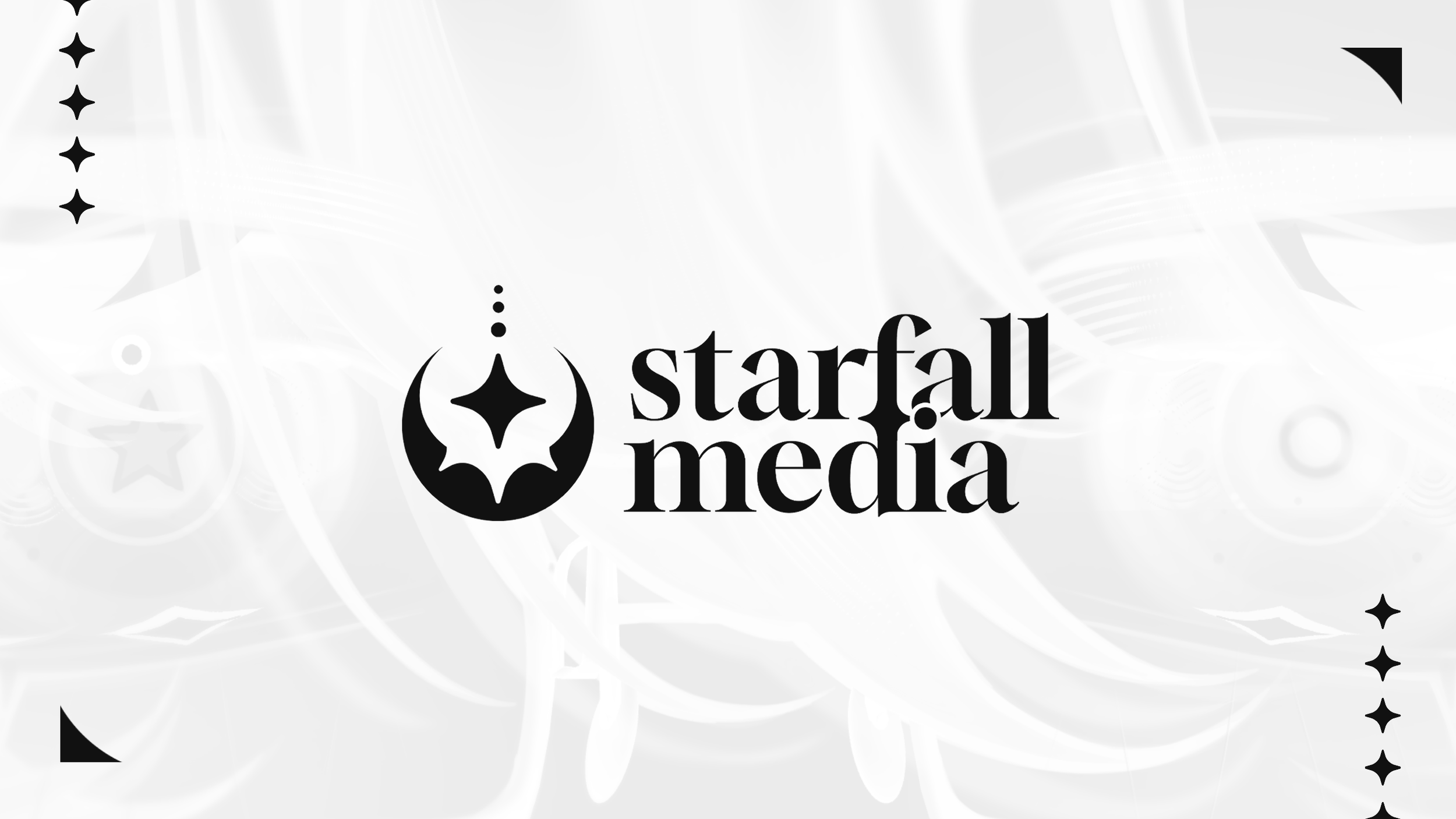
The mini stars used in the branding are the same as the one in the logo. Alonside some stylish pattern usage and iconography, the branding for starfall media ended up as a sleek display of their professionalism that reflects their name.