Stridepal: Application & Branding
Home ➔ Stridepal
Overview
After the ideation stage, the solution chosen was the creation of a front-end prototype for a new mobile application that utilizes gamification features to encourage people to increase their physical activity levels. This solution would be usability tested to improve the application’s functionality and user experience.
For my Bachelor’s Thesis project, I wanted to pursue a project at the intersection between sports science and gaming, by creating a solution for a real-world problem. Ultimately, I decided to tackle the rising levels of sedentary behavior within younger generations.
Prototyping
The prototyping phase began within the program Clip Studio Paint. The goal of this step was to block out the main areas of content within each page, making sketches for key parts of the user flow diagram made prior to the prototyping stage.
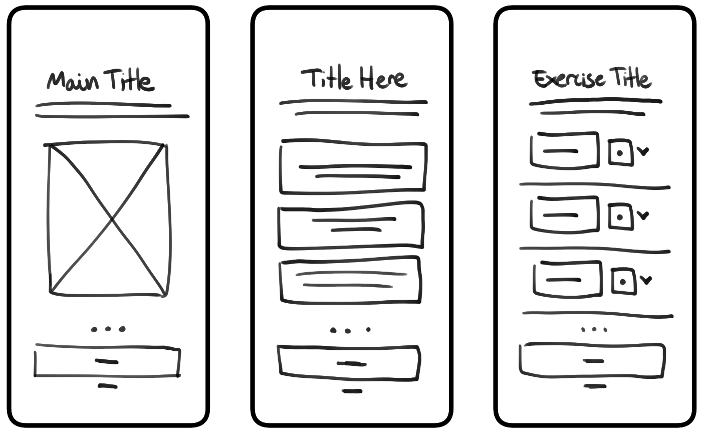
Mid-Fidelity Wireframes
Low-Fidelity Wireframes
Branding
Following the mid-fidelity wireframes, I developed the prototype’s brand book to establish a unique visual identity for the application. Skip, the application’s mascot, was also developed during this time He went through multiple stages of iteration, but the concept of a sporty bunny remained the core fundamental design idea for the project
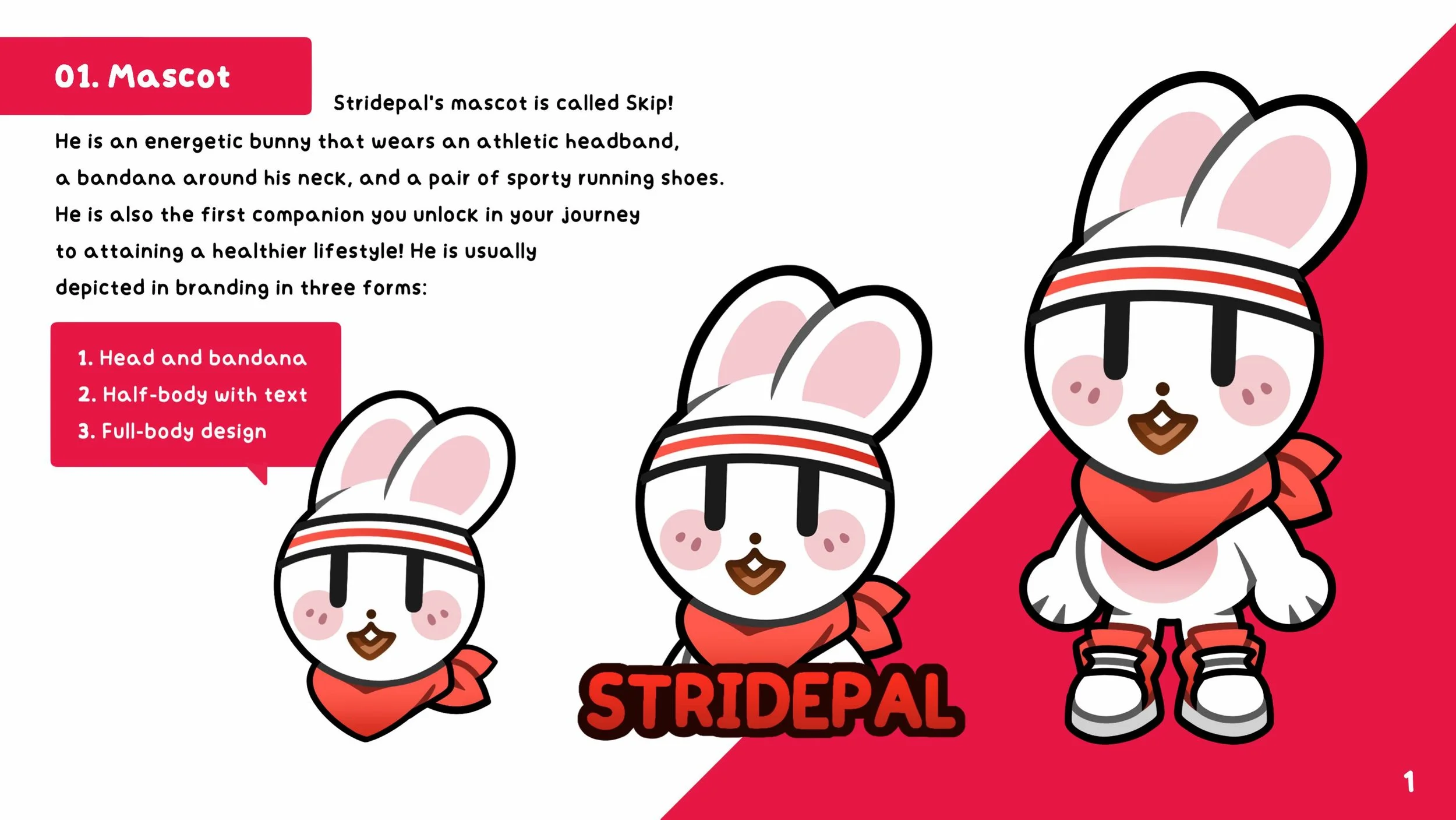
The brand design of Stridepal was made to be appealing to all ages, with the logo mirroring the mascot’s design. Red was chosen as the primary color, representing the energy and passion it aims to instill in its users regarding physical activity.
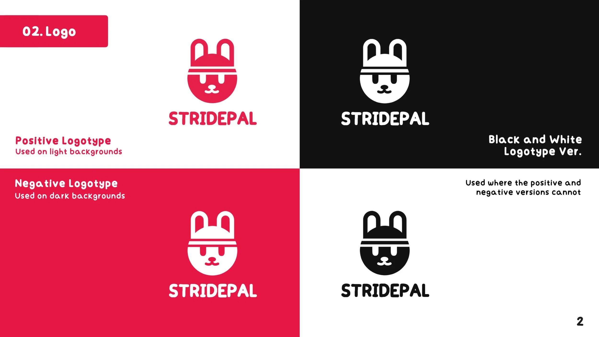
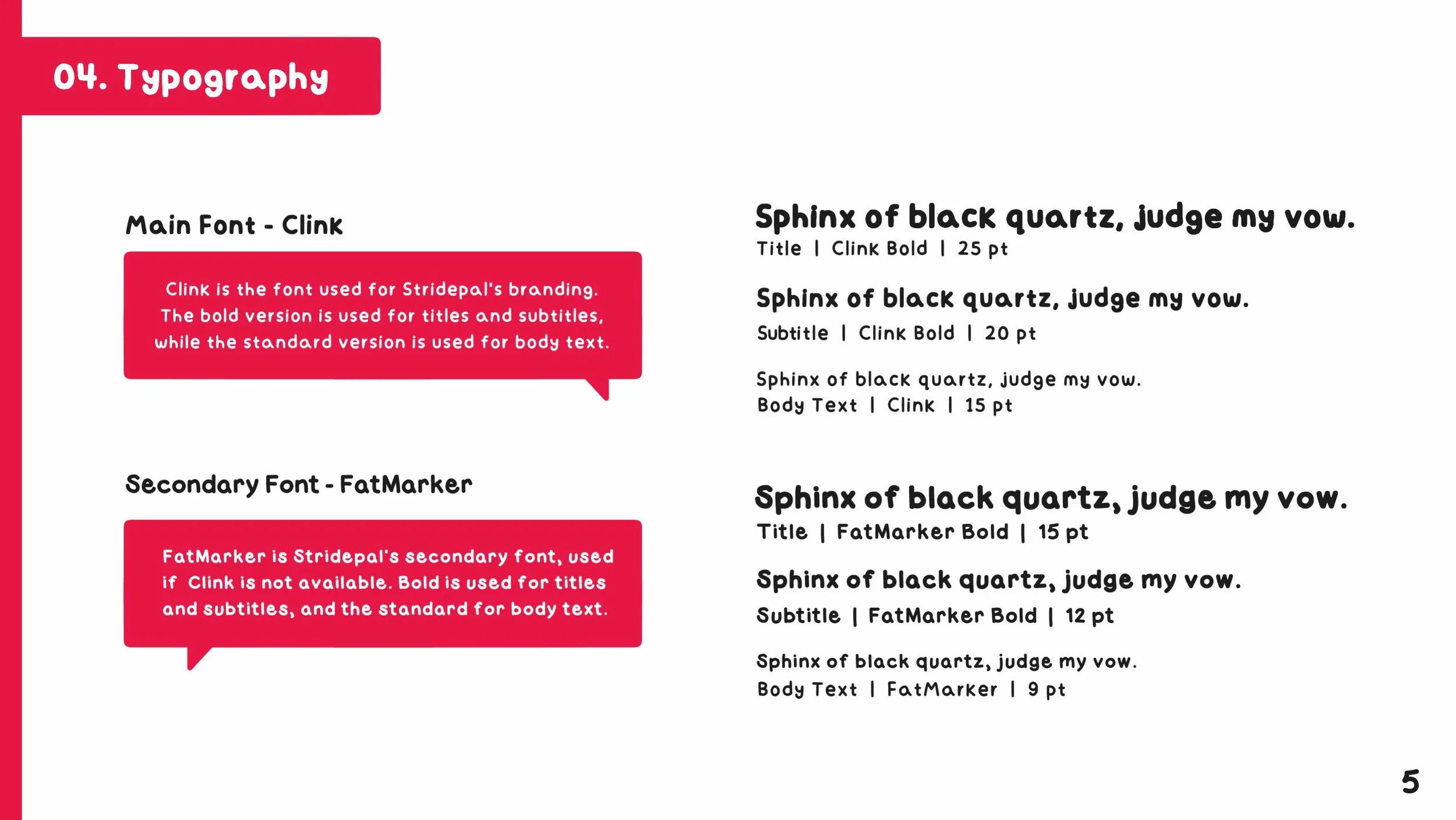
The fonts for Stridepal were selected for their bubbly and comfortable aesthetic, evoking a feeling of familiarity in users. The brand book as a whole was designed to look like a flip-book, with numbered pages and a horizontal layout, following a cute design aesthetic.
Usability Testing # 1
This phase aimed to garner feedback and suggestions for the mid-fidelity wireframes and opinions on the brand book made for the application.
Participants interacted directly with the mid-fidelity prototype while simultaneously completing a questionnaire. The questionnaire used in both parts of the usability test gathered qualitative and quantitative feedback.
The Likert scale questions showed an overwhelmingly positive response for the wireframe’s layout and navigation. Contrastingly, the open-ended questions had more precise feedback, with suggestions around adding the option to cancel a workout early, improving visual clarity for certain features, and reordering elements on the home page.
Results
Final Product
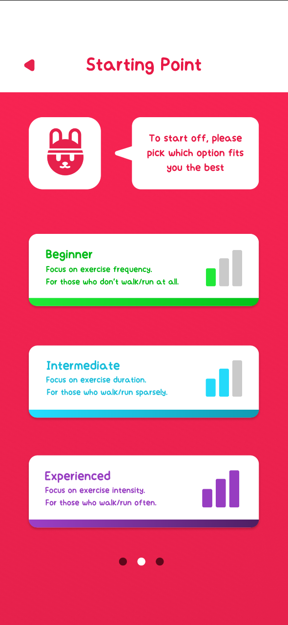
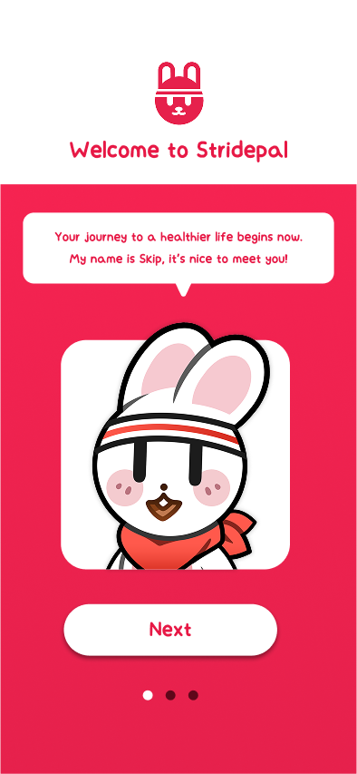
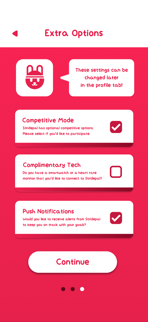
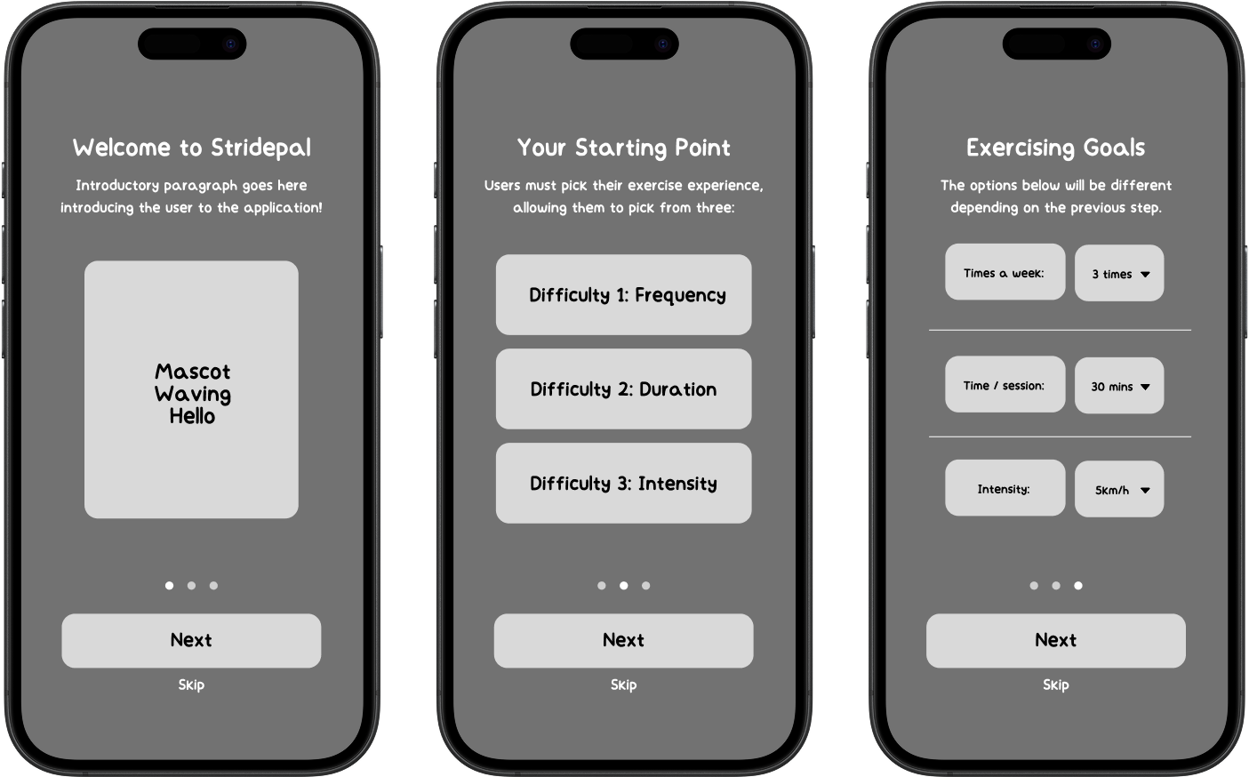
Like in most applications, the onboarding process for Stridepal consists of introducing the user to the application and giving them customization options to fit their needs. The user is presented with different starting points for their journey, and optional features.
Onboarding Pages
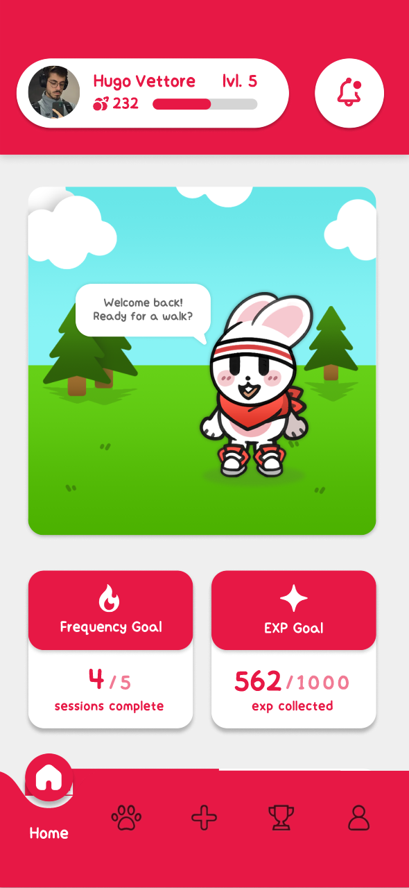
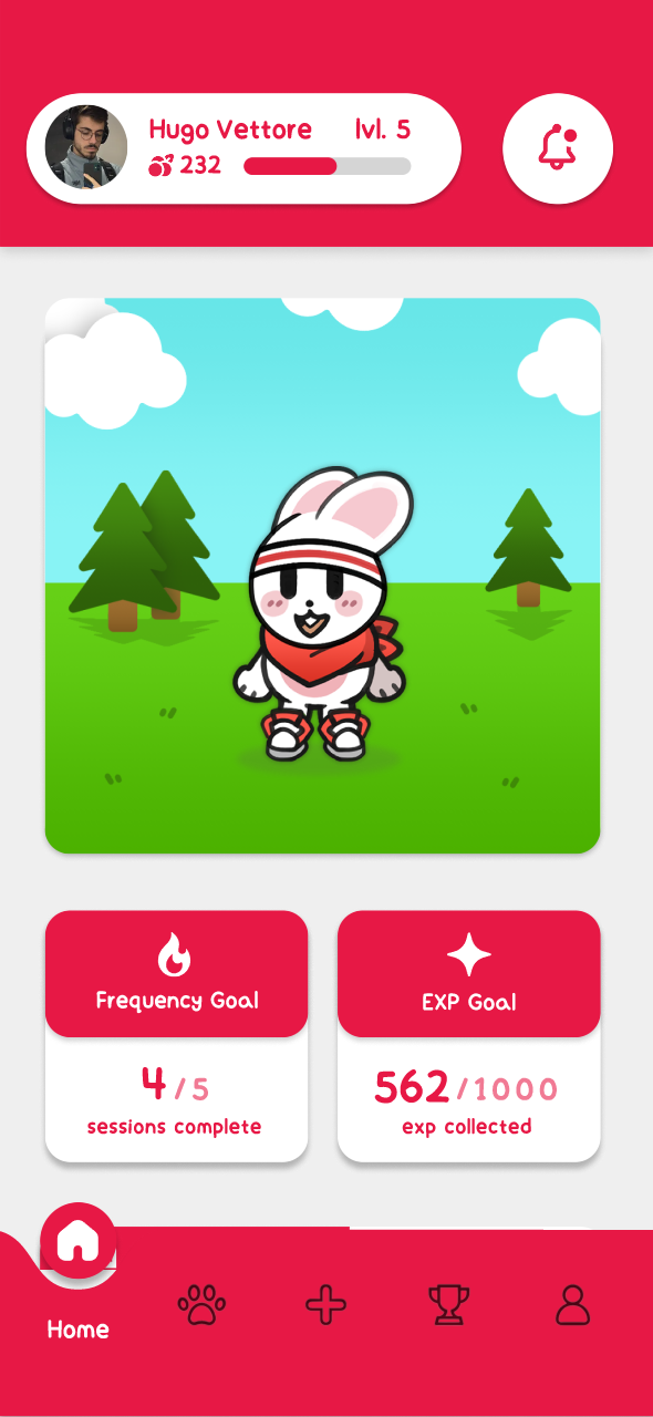
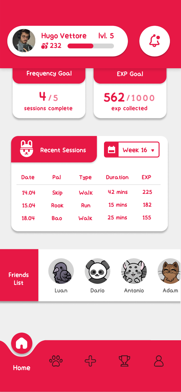
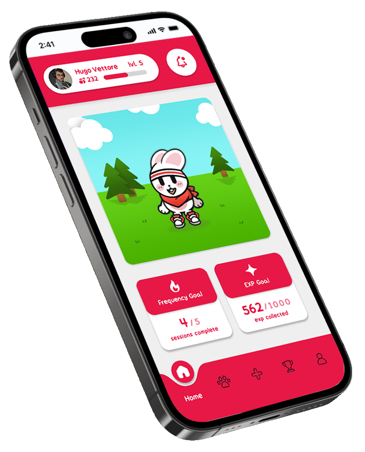
The home tab has numerous features. You can interact with a specific pal by tapping on them or dragging them around, as they motivate the user to get moving. The bottom of the wireframe has a functioning hotbar to the other pages.
Home Tab

Pals Tab
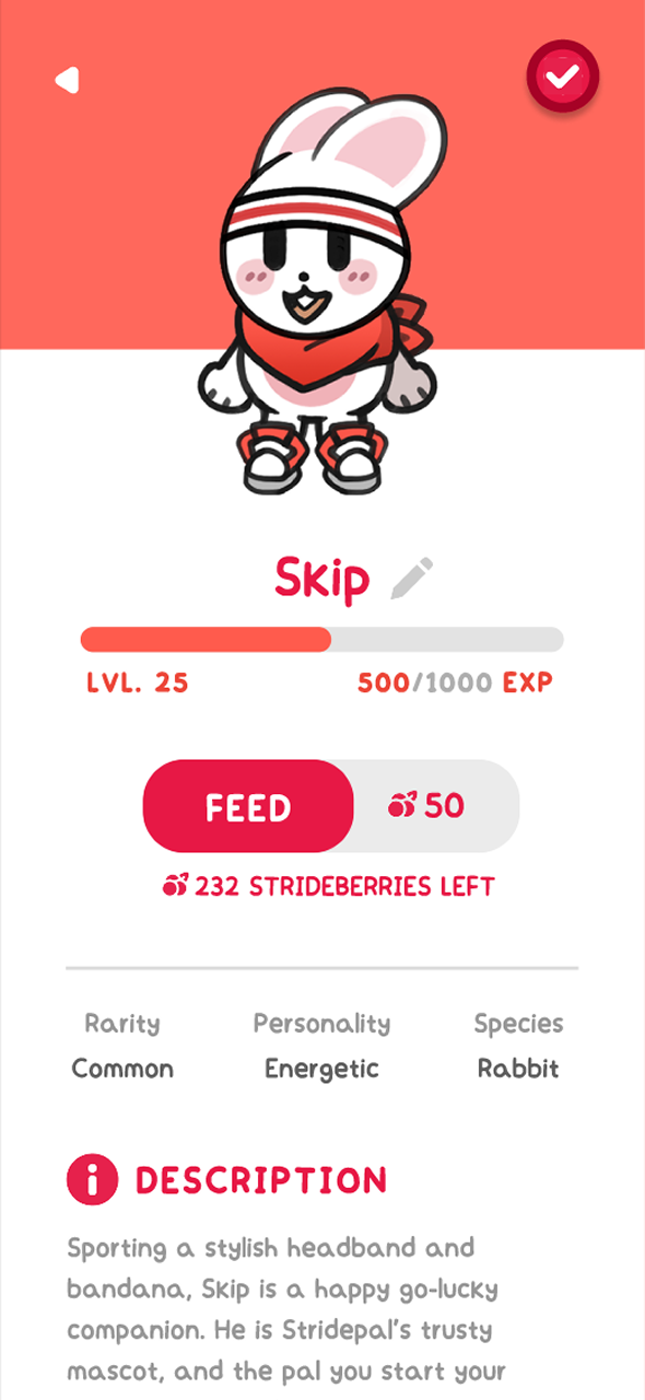
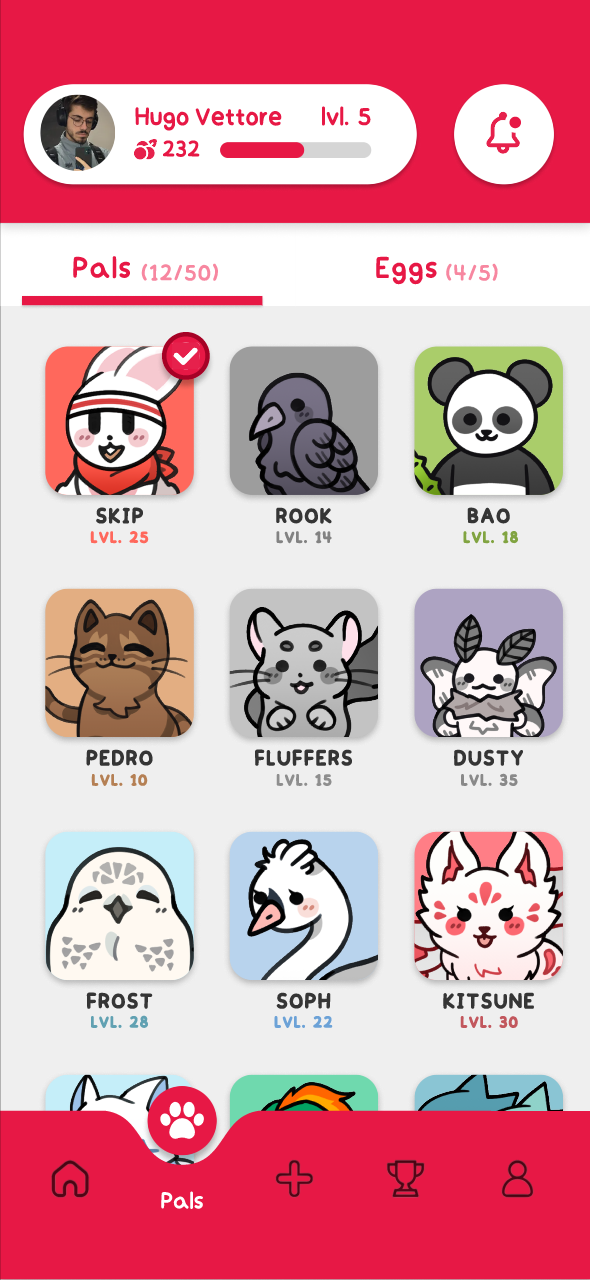
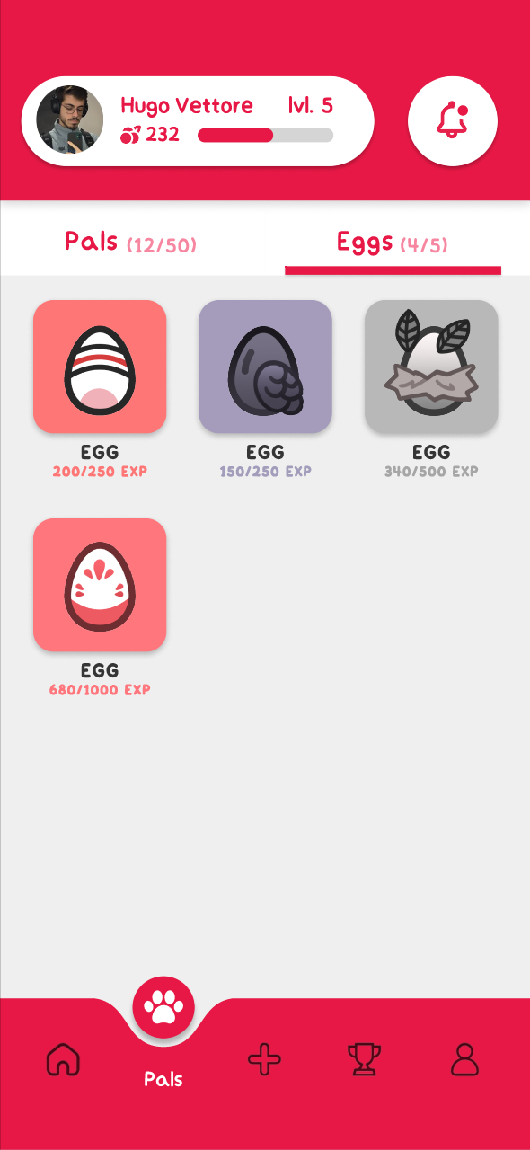
The pals tab has the main selling point of the project: the pals. You can feed them with berries gained from exercising, making them stronger over time. Each pal has a rarity, personality, and a unique description within their page. New pals can be obtained by finding eggs while exercising, and hatching them by using experienced gained. The pals were all designed specifically for this project.
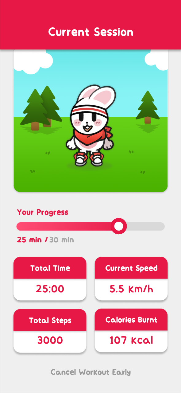
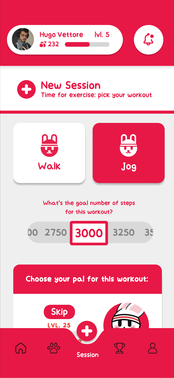
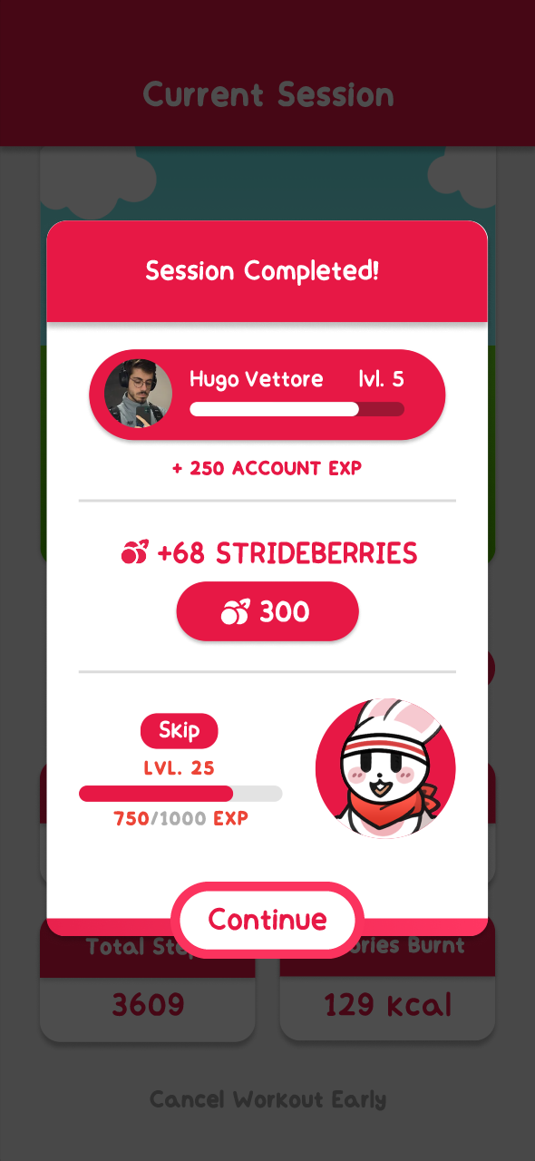
Starting a new workout is made simple and easy, where the user can choose a goal number of steps and a specific pal that will exercise with them. This pal will motivate the user if they slow down, and showcase stats during the workout. Upon completion of the workout, the application will show you the rewards on both currency, and experience for your chosen pal.
Workout Tab
Usability Testing # 2
After completing the refined high-fidelity prototype, another usability test was scheduled and conducted. The goal was to garner feedback on the high-fidelity wireframes through a questionnaire and a structured task list that a moderator guided participants through.
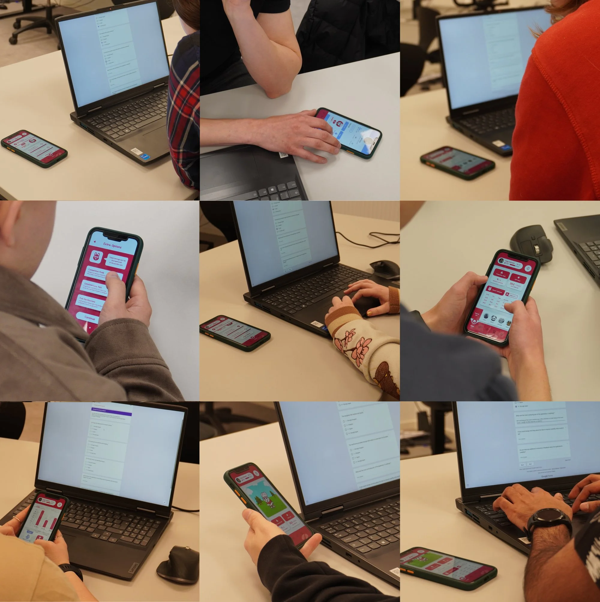
The Likert scale questions showed a net positive response from respondents about the wireframe’s layout, navigation, and clarity of information. Three long-answer open-ended questions related to the usability were present in the questionnaire, each garnering solid pieces of criticism. The main points of improvement pointed out were: streamlining the statistics tab, moving around certain features between the tabs, and making clearer dinstinctions between account EXP, weekly EXP goal, and the individual pal EXP.
Results
Final Bachelor’s Thesis Grade: A